Design a streamlined tool to enhance the user multitasking management experience
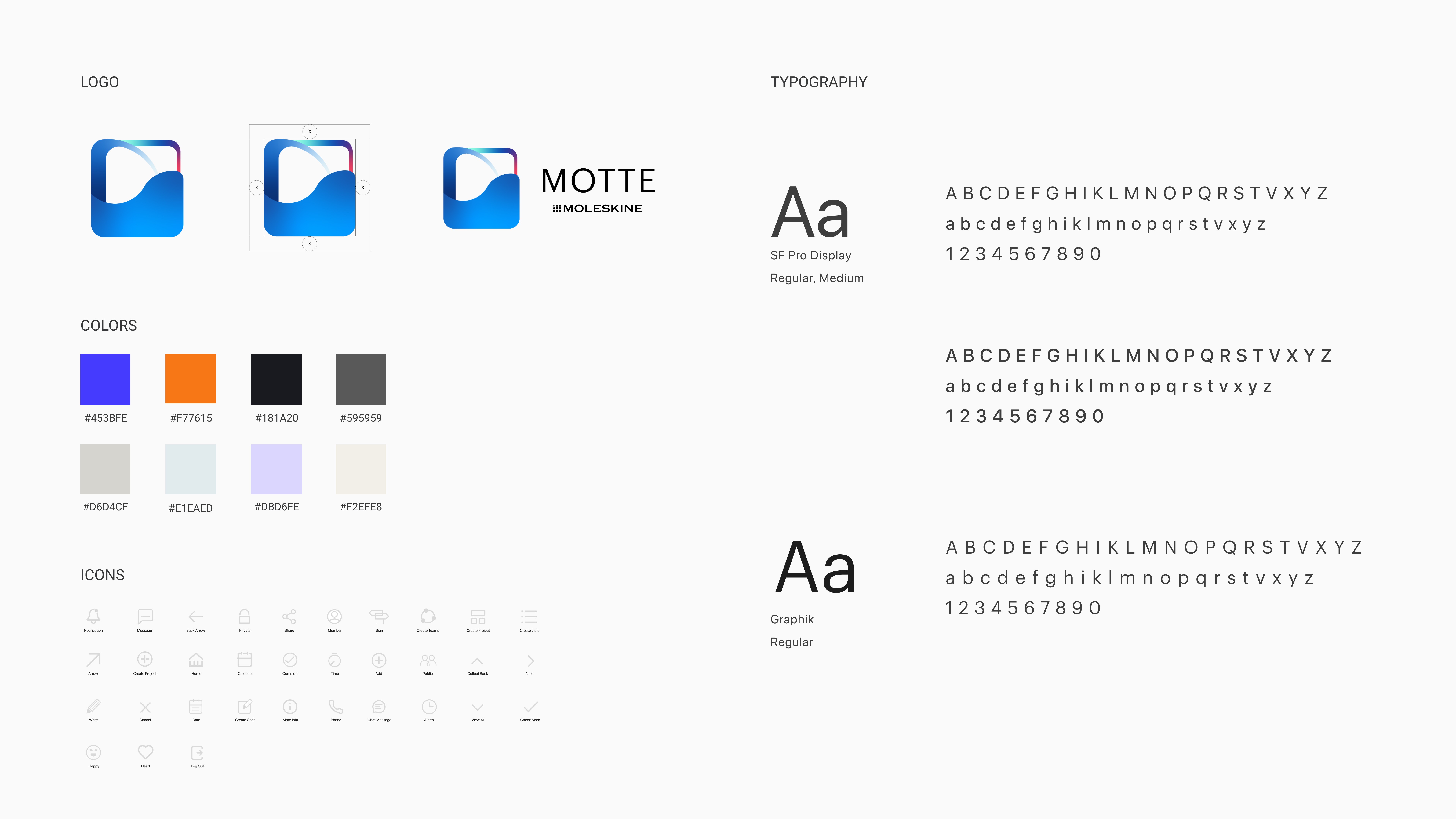
Moleskine Management App
Motte is a productivity management app designed specifically for college students, offering a streamlined experience for multitasking. It allows students to manage both their college work and personal life, catering to the diverse needs of today's college students. (This is a concept work and is not affiliated with Moleskine)
Project Type
User Experience
User Interface
Identity Design
My Role
UX Research
UX/UI Designer
Design System
Team
Product Designer
Timeline
Project Background
Delivery Goal
Discovery Opportunities
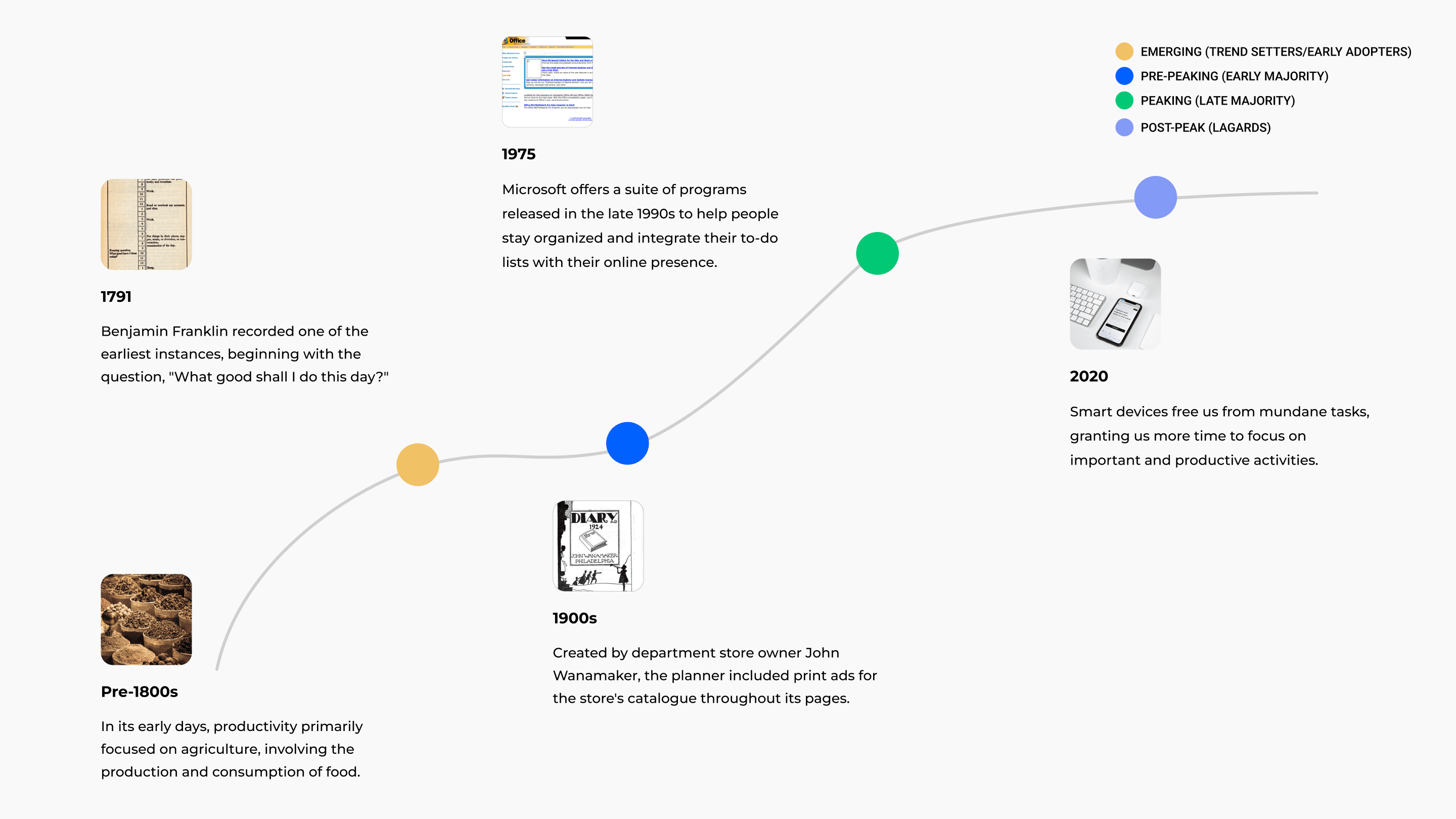
Based on trends in management tools, the key to future tools lies in offering more personalized and customized options. Moleskine, as a traditional media brand, is always seeking innovation.
Therefore, I considered how we can add more value to the brand.
Project Goal
Problem Statement
Why do college students lack the awareness of using project management tools?
Research Findings
Product Solutions
How might we integrate college students' daily needs with project management tools to reduce their stress and minimize the time required to learn new systems?
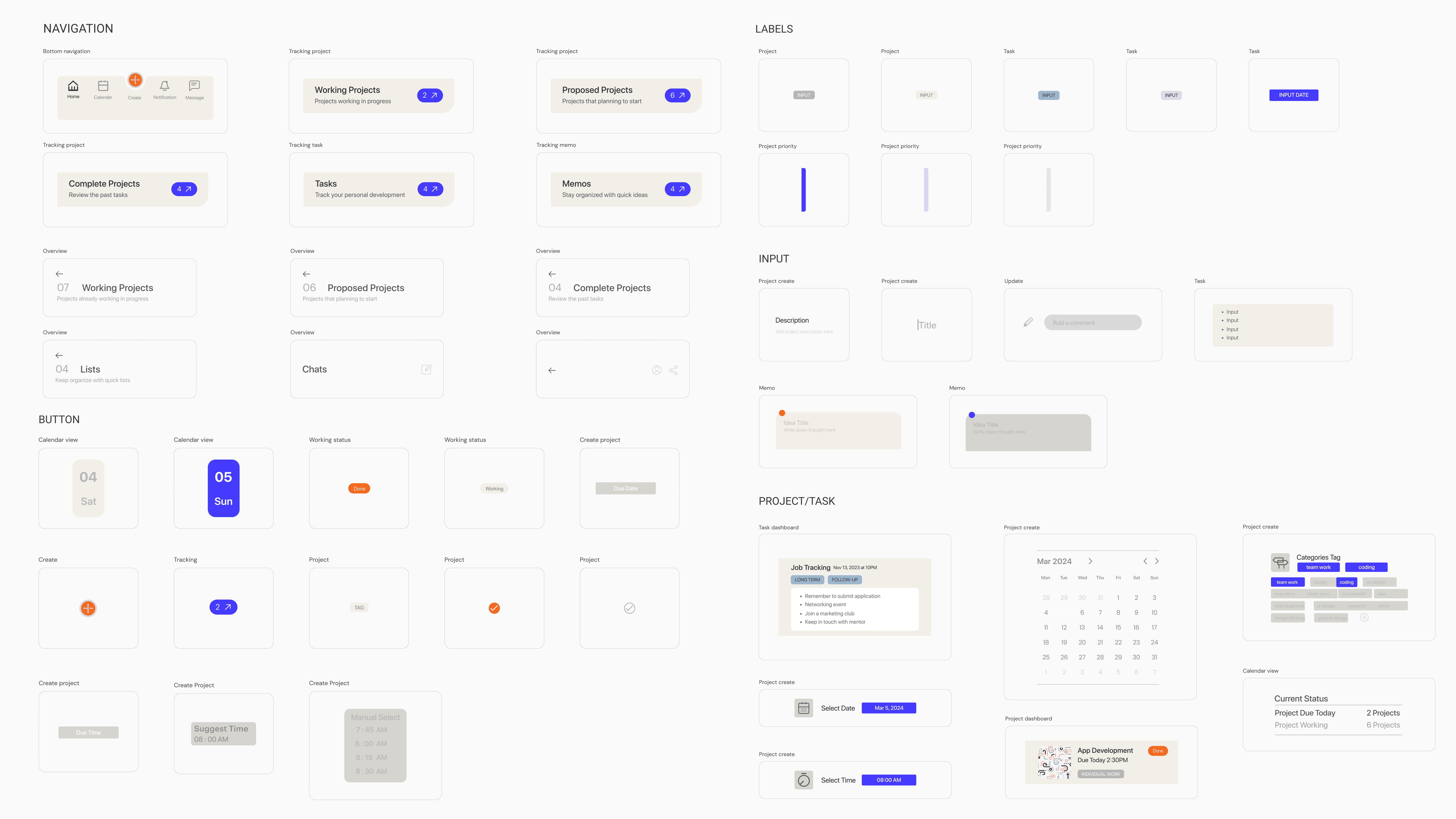
Main features
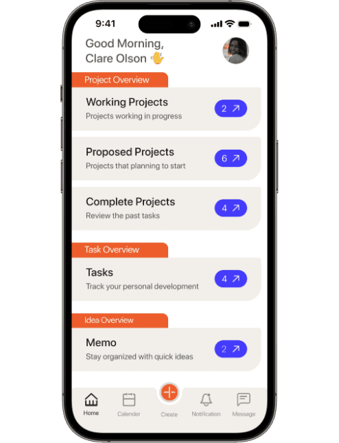
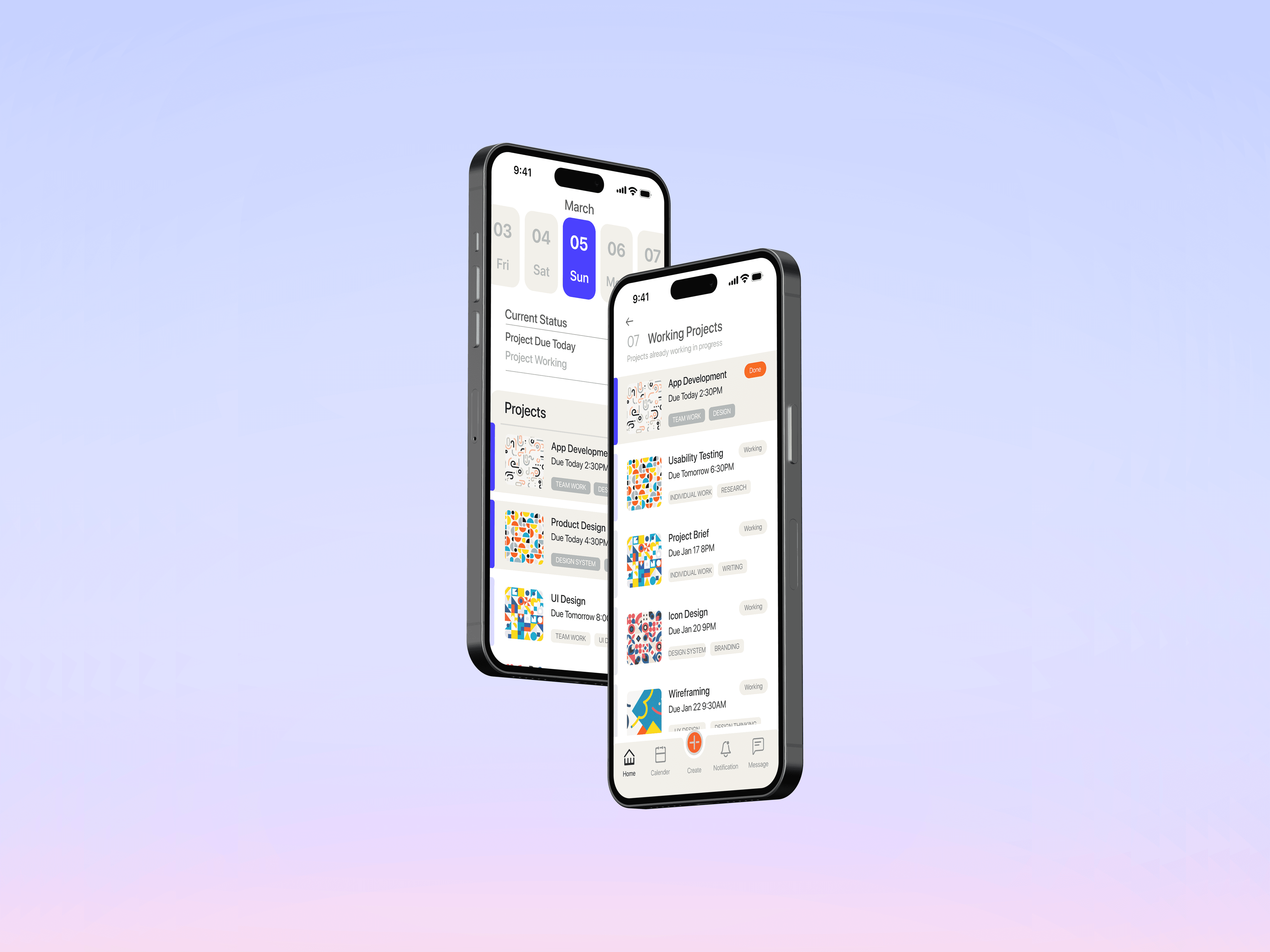
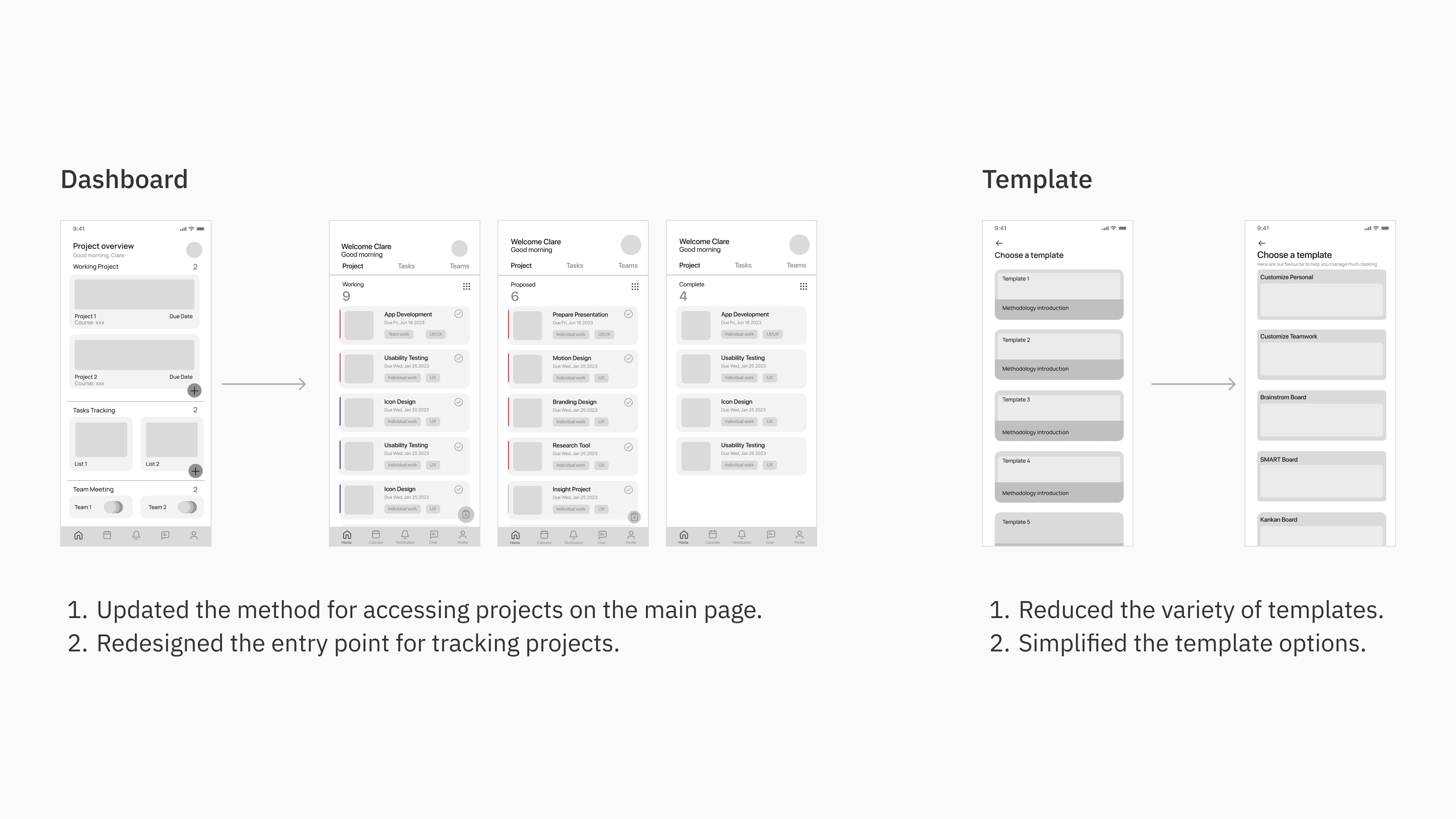
Dashboard View
Track status from home
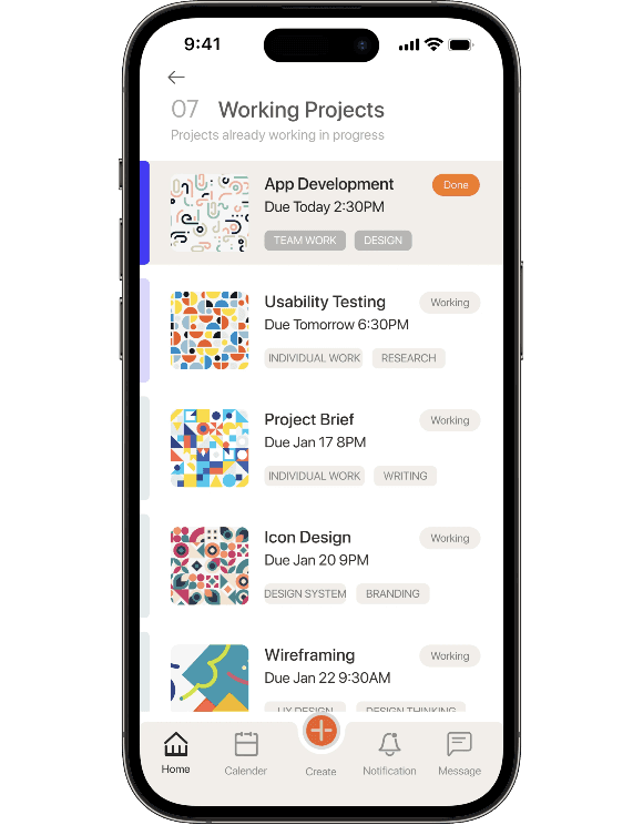
Projects Status
Get into detail of status
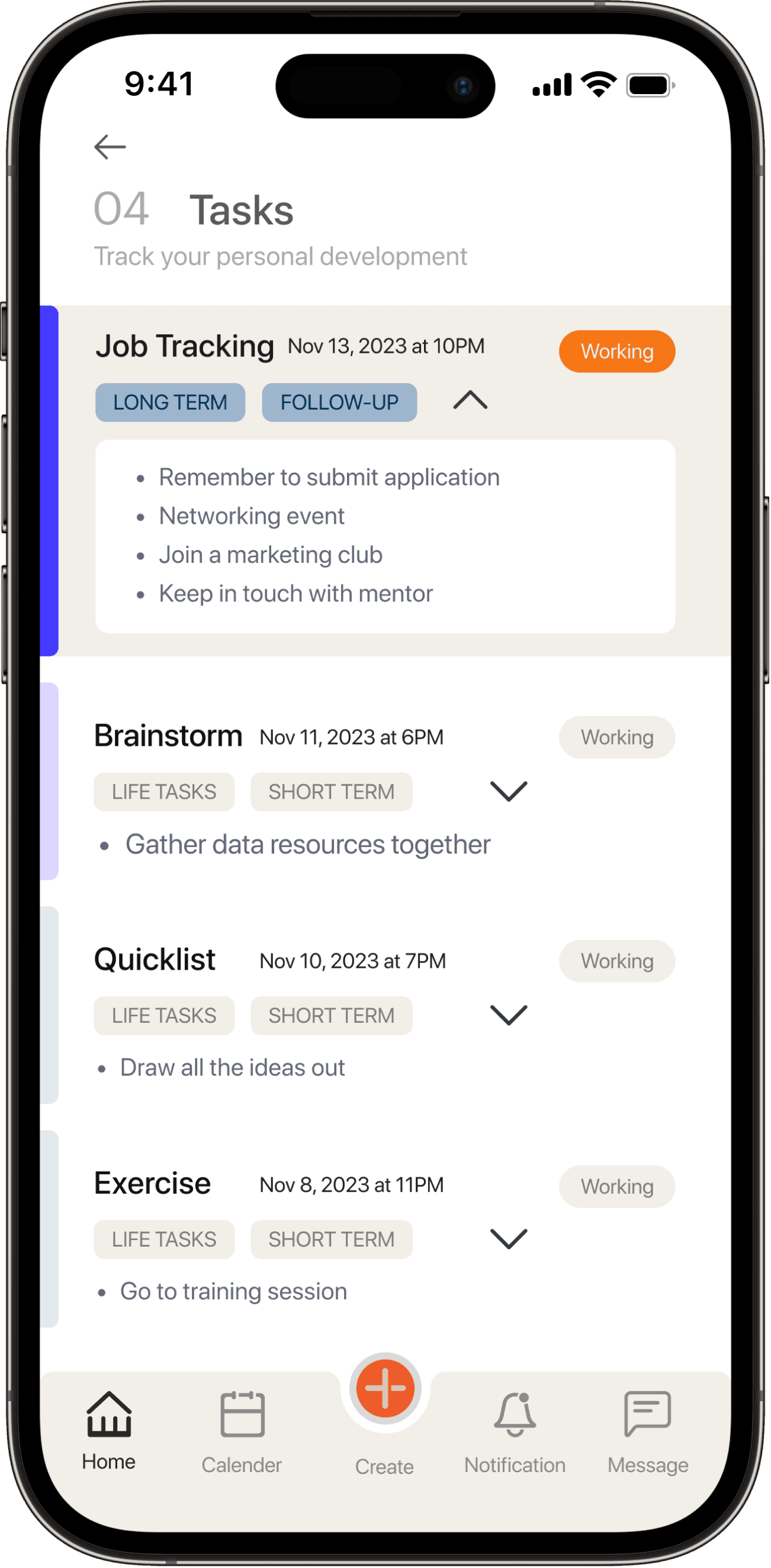
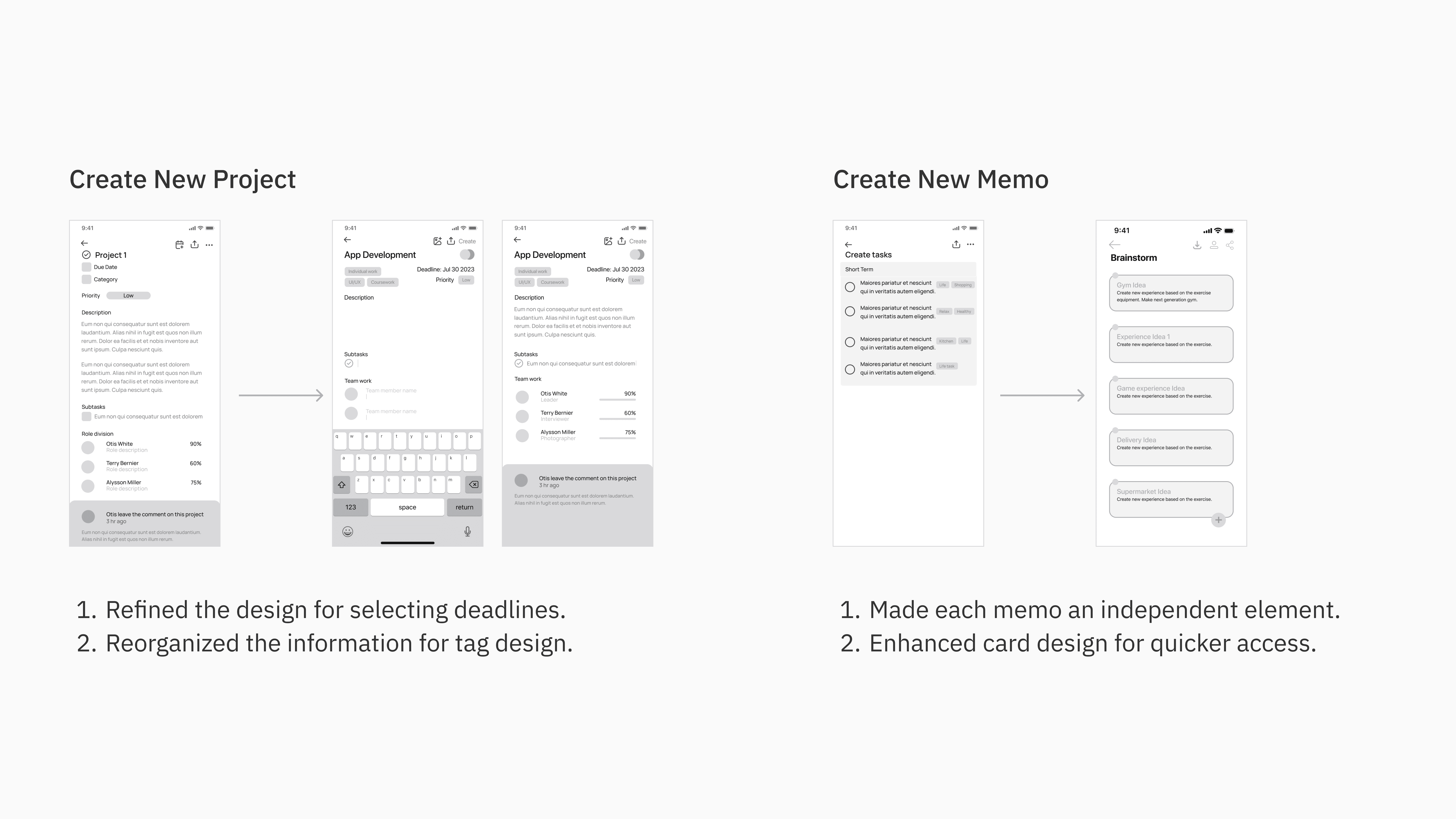
Task Management
Track personal lists
In addition to coursework, students can track both short-term and long-term personal tasks for personal development. This feature helps students feel a sense of control over their lives and reduces the feeling of overwhelming pressure.
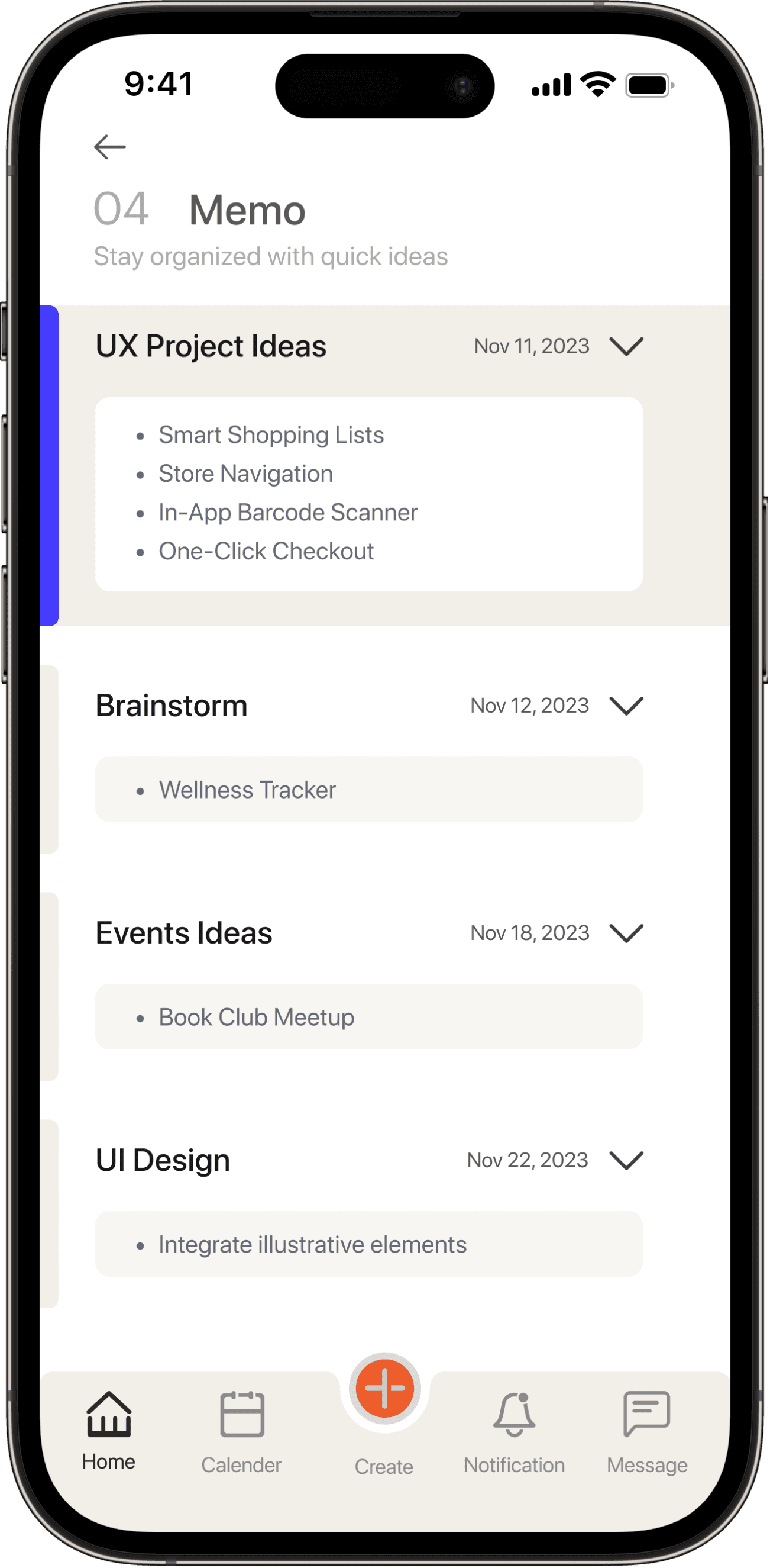
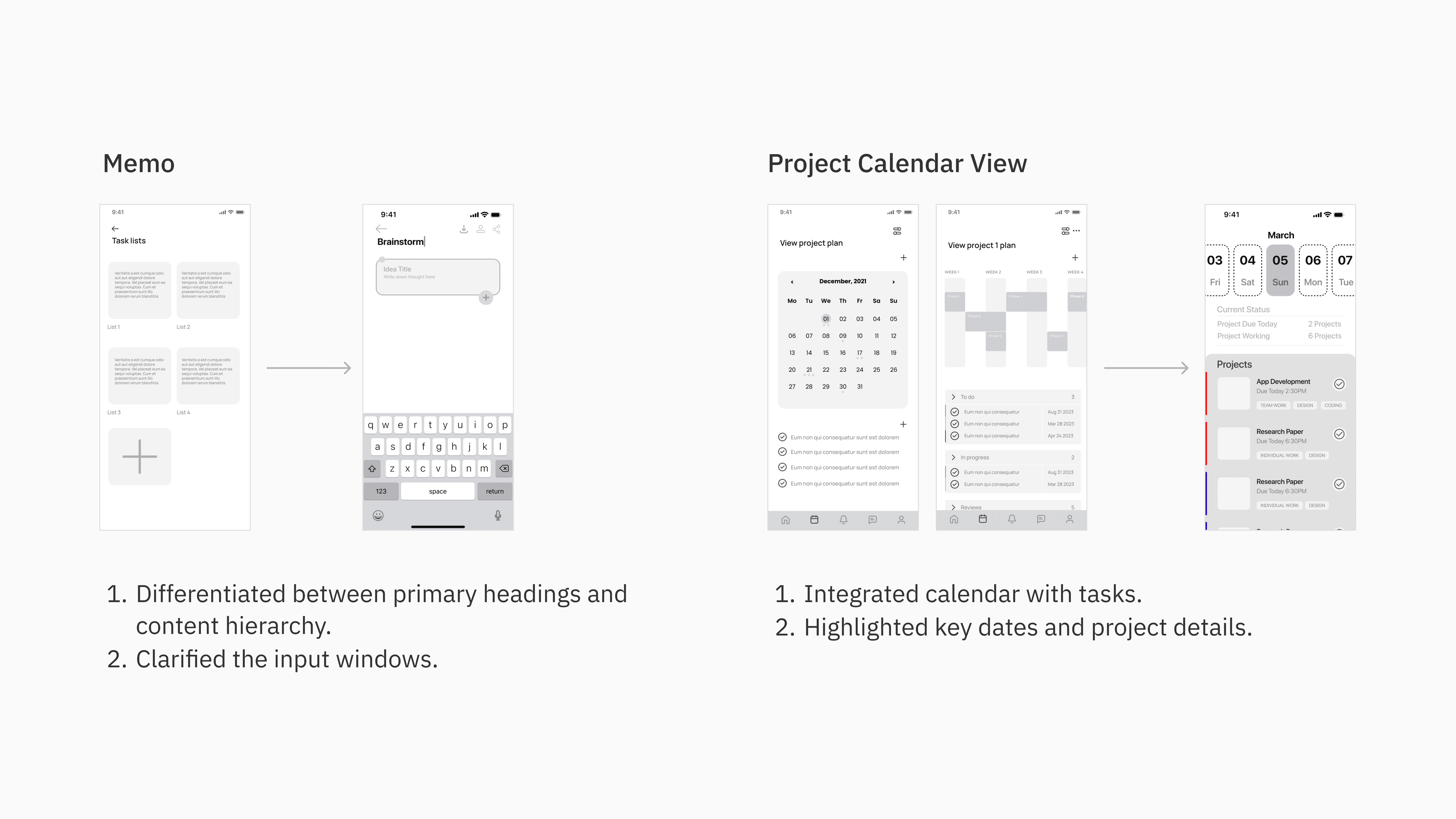
Quick Memo
Captures floating ideas
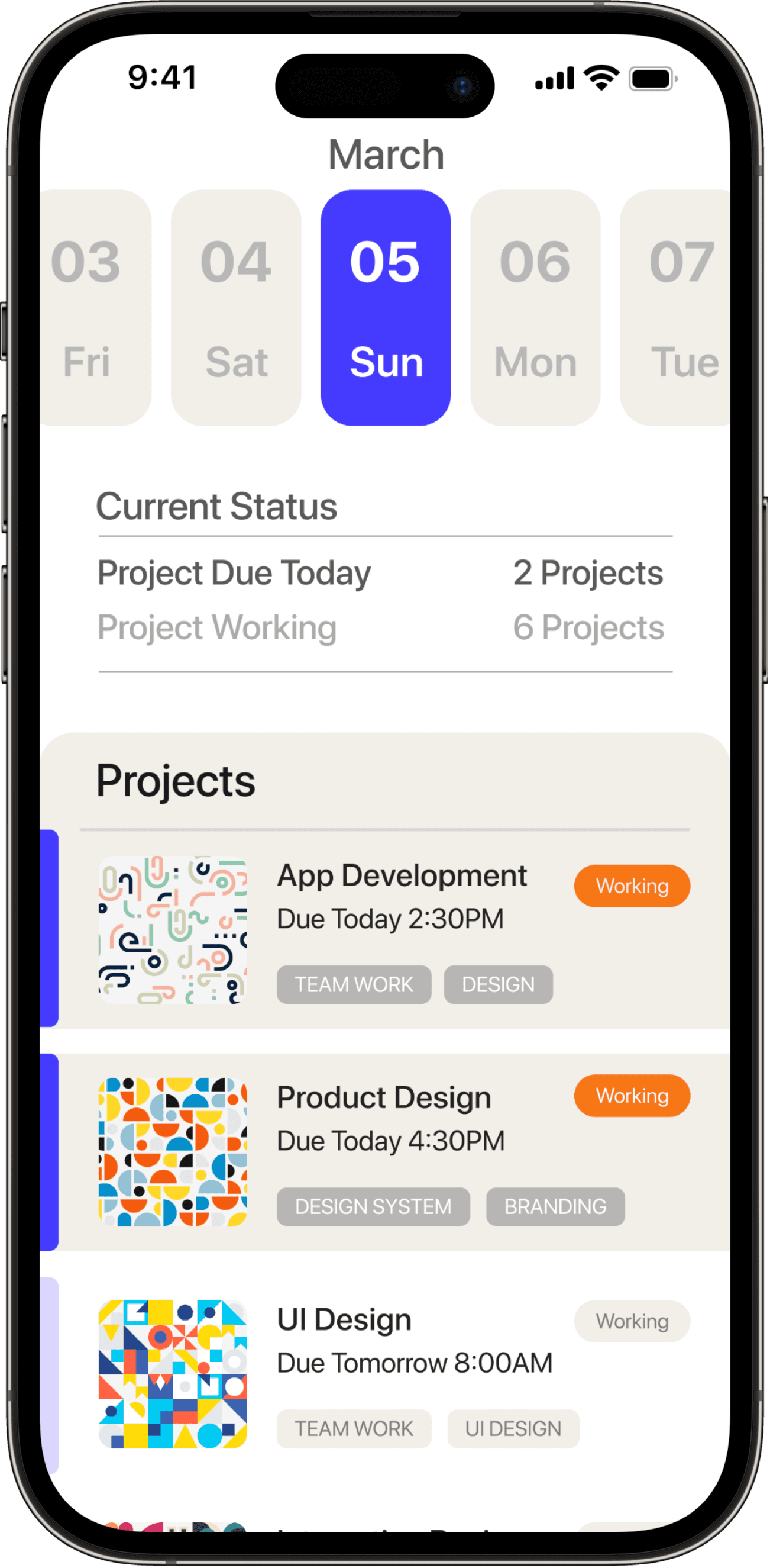
Dashboard & Date Picker
Project Calender View
Design Process
Research
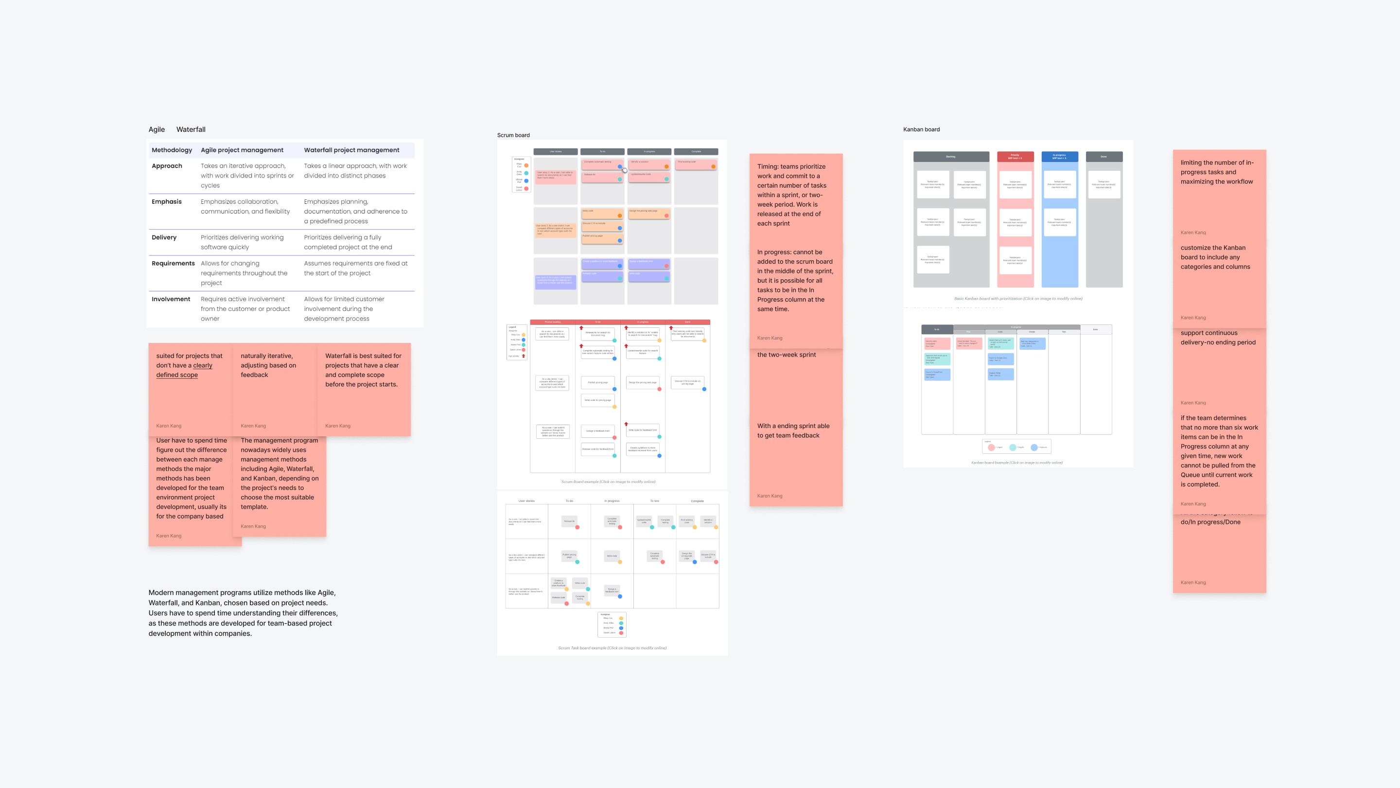
Understand management methodology
Findings: Current popular project management methods are designed for team-based projects within companies, but college students may not have in-depth exposure to these methods unless they seek out supplementary resources.
Solution: Motte will bridge the gap by making the management approach accessible to college students.
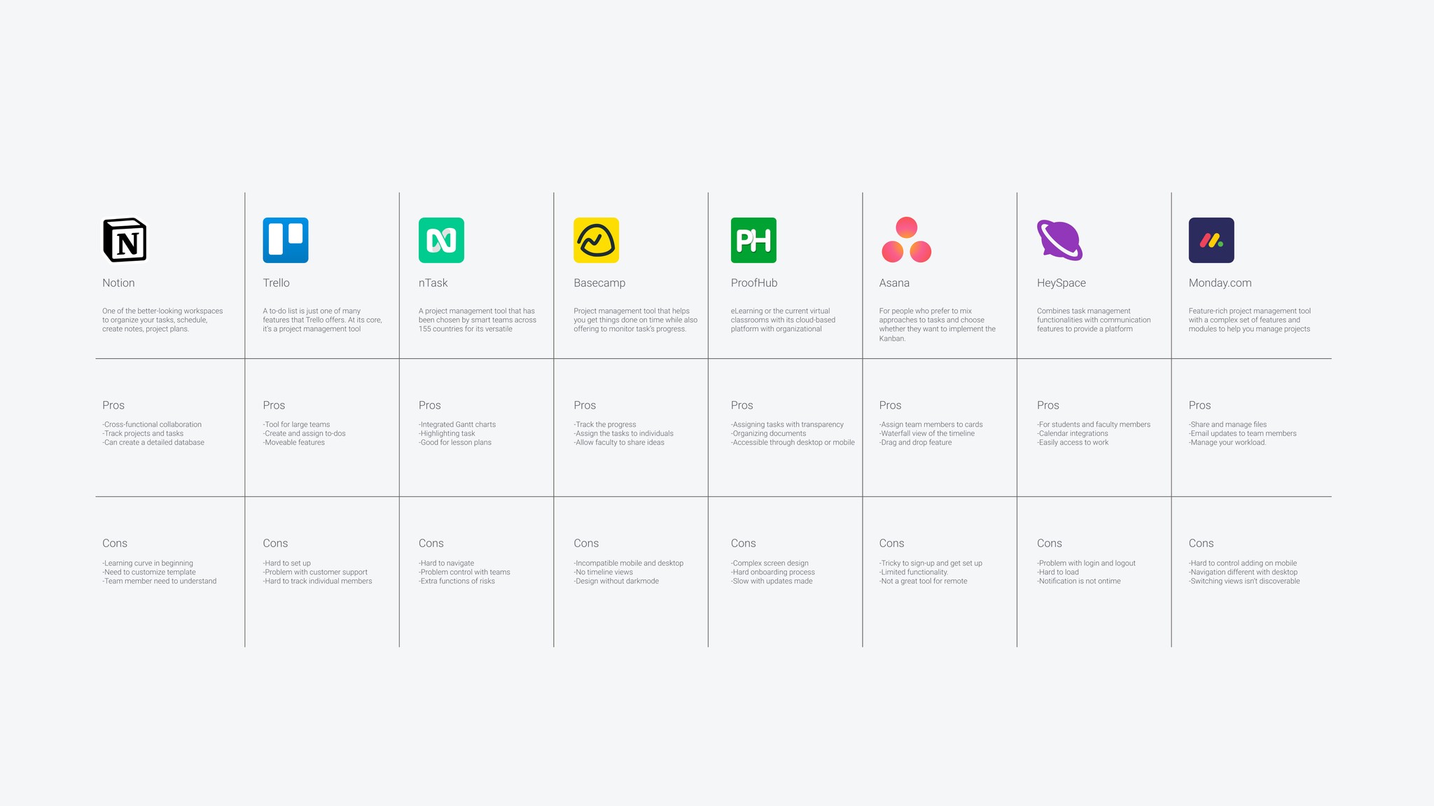
Analyze how competitors help specific user groups
Findings: Each project management software offers its flagship templates and a variety of other options. While experienced users can select the appropriate template based on company team needs, the flexibility in template selection can lead to uncertainty for college students.
Solution: Motte will reduce learning costs by focusing primarily on a limited number of templates tailored for student use cases.
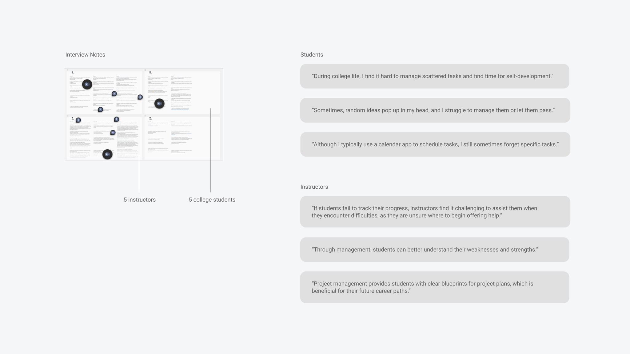
Conducted 10 interview including 5 students and 5 instructors
Findings: The interview shows that 80% of students avoid management software, relying on default memo and calendar tools, while 20% struggle with template selection in comprehensive project management software.
Solution: Motte will integrate the features users are looking for from different software, providing a platform with all the main features in one place.
Insights
Design insights

1
Students need a default template that requires fewer clicks than the project-oriented management templates.

2
Students have limited time to access and manage projects; therefore, there is a need to streamline management steps.

3
Students need a product that addresses not only academic projects but also personal development goals, encompassing scattered objectives.
Design Process
Key User Flow
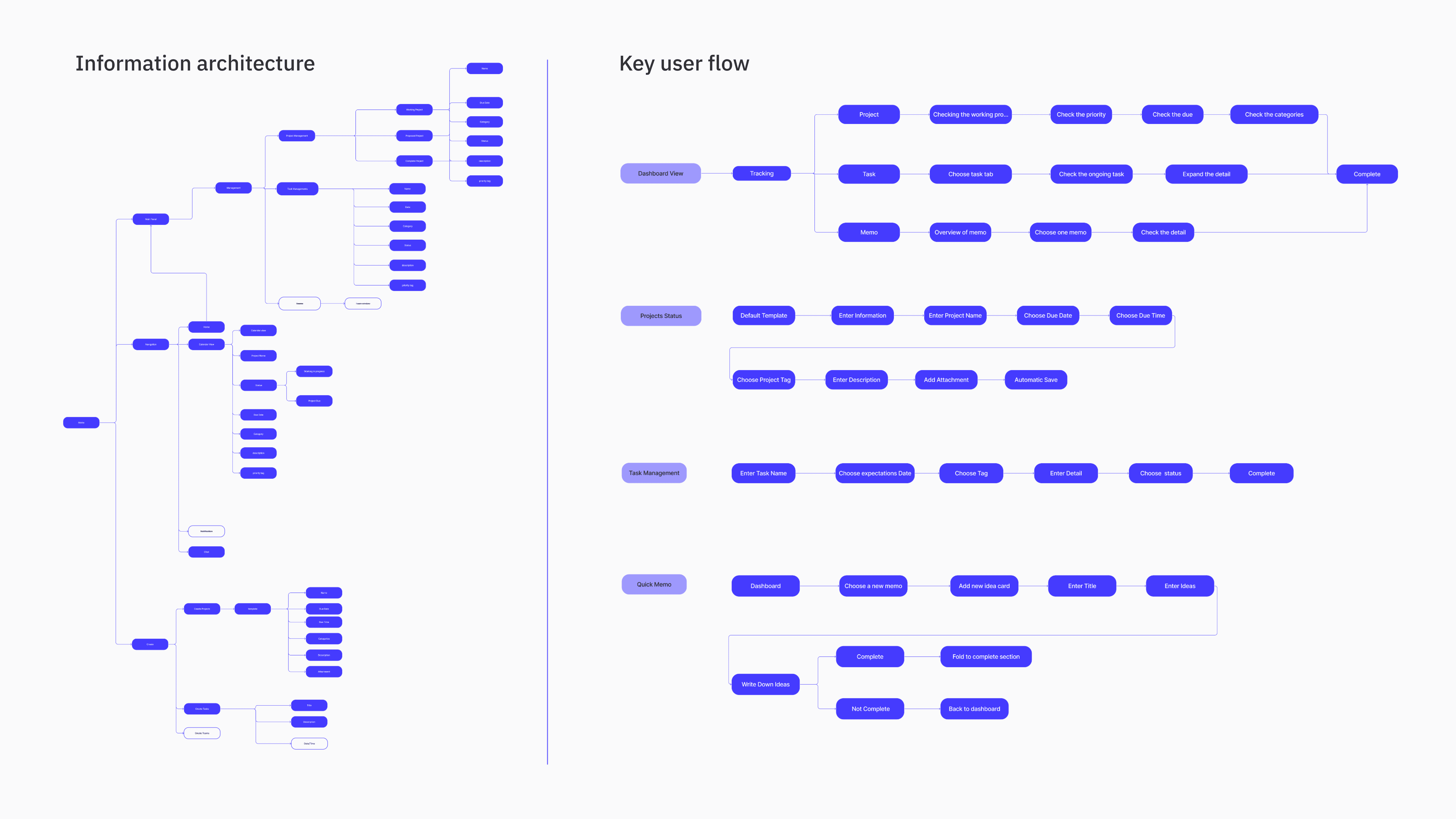
Due to the broad and scattered scope of the management tool, I started with IA to get an overview and then defined the key user flow for further expansion.
Ideation
Based on the information architecture and user flow, I started with low-fidelity wireframes, focusing on how to prioritize ideas
Test Summary
Feedback
I conducted usability tests with high-fidelity wireframes, for a precise information hierarchy, involving three college students without full project management experience.
Users are distracted by the extensive use of highly saturated colors, which can make it difficult for them to focus on the content and lead to fatigue.
Users often mistouch closely positioned buttons, indicating the need for better design accessibility, such as increasing the spacing between interactive elements.
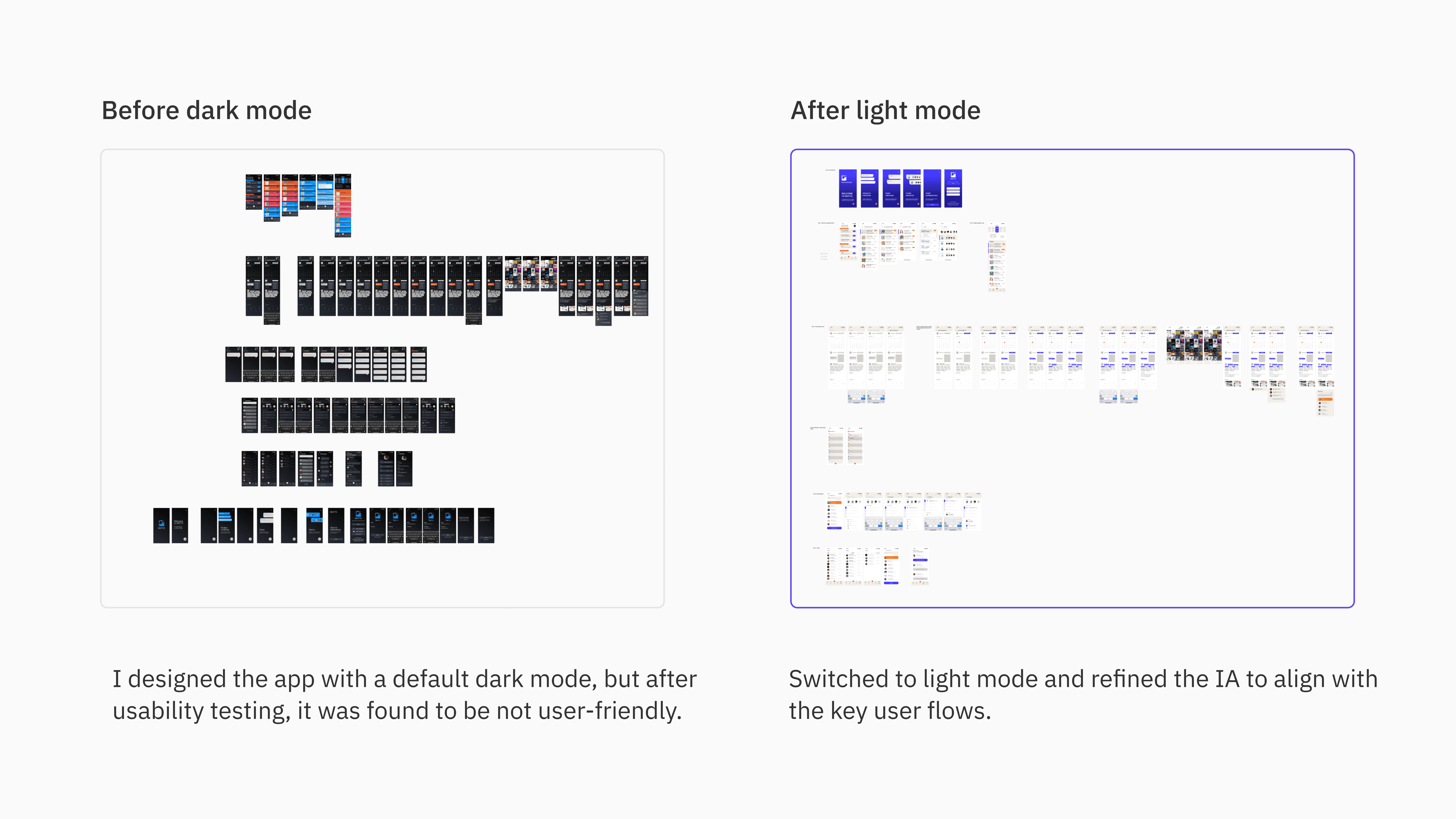
Users prefer a default light theme with dark mode as an alternative option, allowing for flexibility in different scenario and catering to individual preferences for readability.
Users feel the homepage hierarchy could be further clarified, suggesting that a more organized layout with distinct sections and intuitive navigation.

Design Outcome
Iteration
Takeaway
Immersing in the UX design process
As a conceptual project, I am honored to have designed this product, which has allowed me to thoroughly explore and understand the UX design process.
Narrowing the project scope
Starting with a broader project scope helped me identify numerous user pain points and ideas, but defining a specific project scope upfront would have made the design process more efficient.
Breaking down the design plan
By considering every aspect from research to design, this project has become a concrete representation of the design process. However, I recognize that there are still areas for improvement.
Next step…
I intend to expand the sample size by engaging college students in testing the management tool to observe their usage patterns. This will enable me to uncover additional insights, aiding in the future refinement of the product.